Arcadia Collateral Risk Simulation: Progress Report 5
The fifth in a series of updates on the joint project by Llama Risk and Pragma Labs for the Arcadia v2 protocol.
Previous Reports
Report 1 - February 9
Report 2 - February 14
Report 3 - Feburary 21
Report 4 - February 27
In our last update, we detailed our investigation into the empirical borrower data model and its significance for enhancing the realism and dependability of our simulation. This week, we will focus on a more detailed analysis of the Simulation Output for RETH vs USDC and discuss our approach toward developing recommendations for protocol parameters, including Liquidation Factor, Collateral Factor, and Exposure.
The structure of this progress report is as follows:
Simulation Output for RETH vs USDC Single Asset Scenario: This segment presents an in-depth analysis of the simulation outcomes comparing RETH to USDC in a single asset scenario.
Progress: This section provides a summary of the progress achieved, including milestones reached and improvements made to the simulation this week.
Next Week's Goals: This part outlines our planned objectives aimed at further improving the simulation's precision and expanding its scope.
Next Week’s Post: Here, we give a sneak peek into the next update.
Simulation Outputs: Single Asset RETH vs USDC
The simulation output explored the dynamics of Single asset RETH versus USDC pair across a period from "2023-11-10 00:00:00" to "2023-11-10 12:00:00". It featured 62 accounts and one liquidator and utilized an empirical borrower initialization model to simulate debt scenarios. Focused on RETH, the simulation varied collateral factors (0.75 to 0.95), liquidation factors (0.8 to 0.9), and set the exposure limit at 200.0 RETH. With 30 reruns of the pipeline, this setup provided a detailed analysis of market behaviors and liquidation risks within a controlled environment.
The table below provides a shorthand encoding for six different parameter sets used in the simulation. Each parameter set includes specific values for three parameters related to the RETH asset.
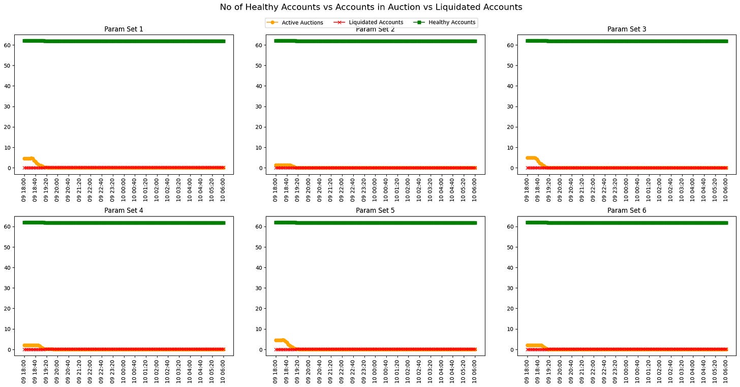
Number of Healthy Accounts vs Accounts in Auction vs Liquidated Accounts
The chart is a collection of six line graphs, each corresponding to a different parameter set labeled Param Set 1 through Param Set 6. These graphs track three account categories:
Healthy Accounts (green line): This line remains consistently at the top of each graph, flat and at a count near 60, suggesting that the number of healthy accounts stays constant and unaffected during the simulation period for all parameter sets.
Liquidated Accounts (red X marks): These are virtually non-existent across all graphs, indicating that there are almost no accounts being liquidated throughout the simulation timeframe for all the parameter sets.
Active Auctions (orange line): This line shows several spikes at the beginning of the period for each parameter set, which suggests that active auctions are occurring at those specific times. The frequency and magnitude of these spikes vary across the different parameter sets but seem to decrease and flatten out as time progresses, indicating a reduction in active auctions over time.
Overall, the chart suggests that, during the simulated time frame, most accounts remain healthy, with minimal liquidations occurring, despite active auctions, particularly at the start of the simulation period.
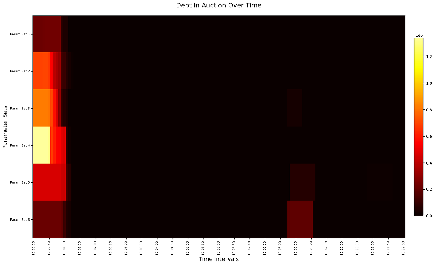
Outstanding Debt in Auctions
The chart depicts the amount of debt in auction over the simulation for the six different parameter sets labeled from Param Set 1 to Param Set 6. The horizontal axis shows the progression of time, marked by intervals, while the vertical axis lists the six parameter sets.
The colors in the heatmap range from dark, representing a low amount of debt, to bright colors such as yellow, indicating higher amounts of debt in auction at a particular time interval for a given parameter set. The color intensity scale on the right suggests that the debt amounts could range up to 1e6 (1 million), with the yellow representing the higher end of this scale.
From the heatmap, we can observe that certain parameter sets and time intervals are associated with higher levels of debt in auctions (brighter cells). For instance, Param Set 1 shows a relatively high level of debt at the earliest time interval, which seems to decrease over time. Similarly, Param Set 4 and Param Set 5 indicate sporadic instances of debt in the auction, but these are less intense compared to Param Set 1. Param Sets 2, 3, and 6 show very little to no debt in auction across the displayed time intervals.
Overall, this heatmap provides a visual representation of the distribution and intensity of debt in auctions over time, allowing for a quick assessment of which parameter sets and time intervals are most associated with auction-related debt activity.
Note: The initial liquidations are a result of a missing initialization condition to only allow empirical positions above a given collateralization factor. In other words, liquidations are triggered immediately as they are not sufficiently collateralized.
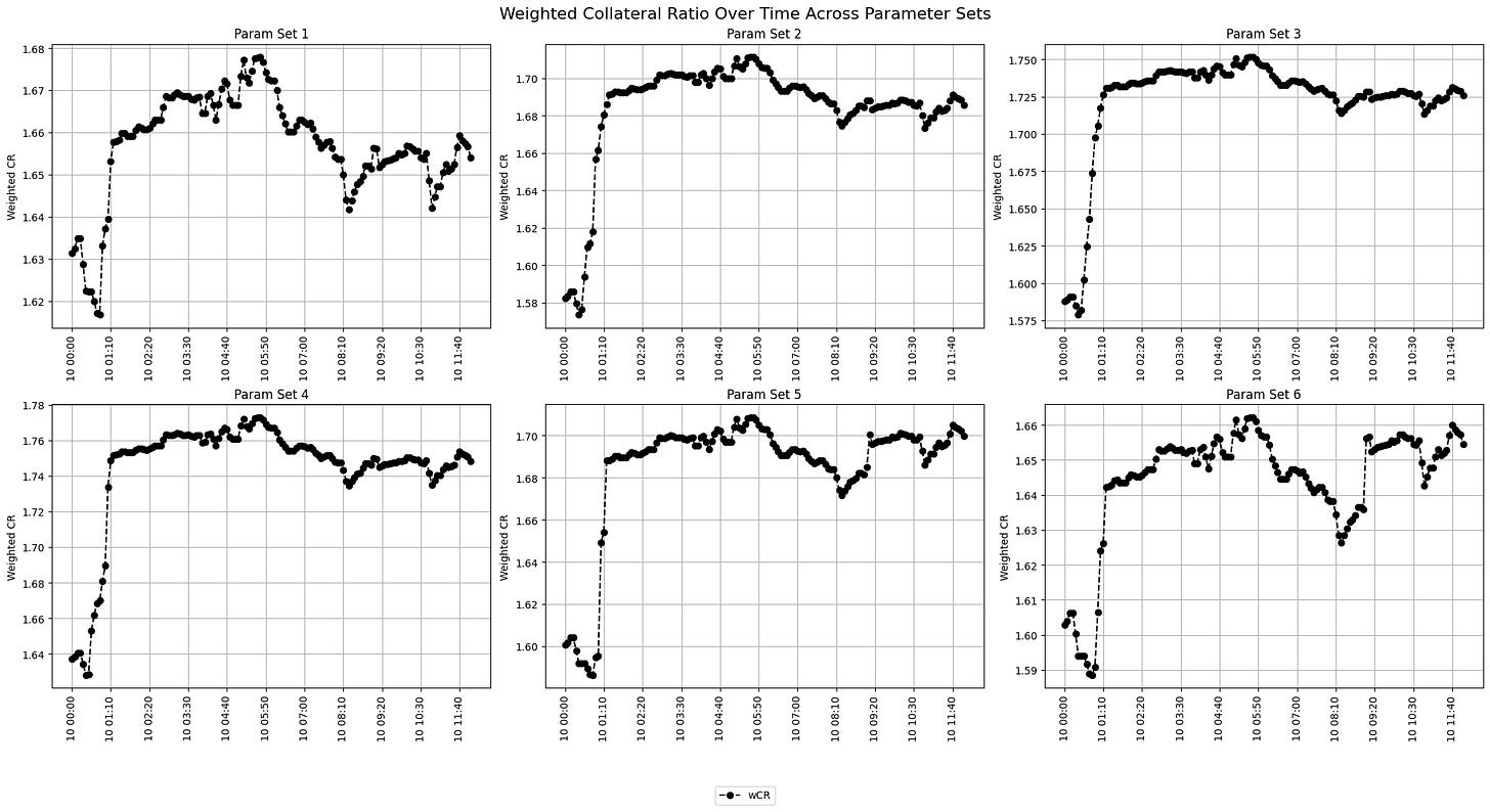
Position-weighted Collateral Ratio
The Position-weighted Collateral Ratio (wCR) over time indicates the health of borrowed positions within the simulation, representing the total value of collateral posted against the amount borrowed.
Observations from the graphs are that each parameter set exhibits a unique pattern of wCR fluctuation. Param Set 1 starts with a sharp increase in wCR before stabilizing. Param Set 2 and Param Set 3 show a steady increase at the beginning, reaching a plateau, and maintaining relative stability thereafter. Param Set 4, Param Set 5, and Param Set 6 display a more volatile wCR pattern, with multiple peaks and troughs. This is in line with what is expected as Param Set 5 and 6 are more "risky" compared to, for instance, Param Set 1.
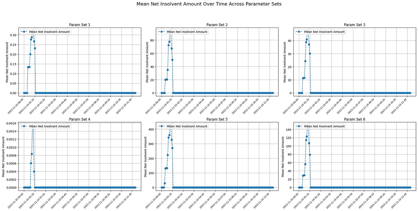
Net Insolvent Amount (a.k.a. Bad Debt)
The graph displays the Mean Net Insolvent Amount, indicating the average amount across runs in which accounts are insolvent (liabilities exceeding assets) at each time point.
Across the the graphs, there is a clear pattern where the Mean Net Insolvent Amount spikes at the beginning of the observed time frame, then drops sharply to a lower level or zero, indicating that the mean insolvency across accounts decreases significantly after the initial period. The spikes in insolvency differ in magnitude across the parameter sets:
Param Set 1 and Param 4 show smaller spikes compared to the others, with values reaching just under 0.30.
Param Set 2 and Param Set 5 show the largest spikes, suggesting a much higher initial Mean Net Insolvent Amount (up to 80 and 400, respectively).
Param Set 3 and Param Set 6 have moderate spikes in the range of 10 to 140.
The consistent drop to lower levels of mean insolvency across all parameter sets could indicate that the system's mechanism to resolve insolvency is effective, or that these were singular events that were corrected over time.
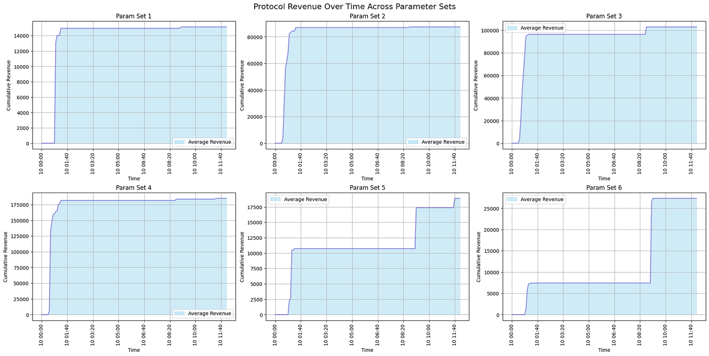
Protocol Revenue
Each graph shows the protocol liquidation revenue over time. In the graphs, there are steps where the revenue jumps at certain intervals, which suggests discrete periods of liquidation events. Variations between the graphs suggest that different parameter sets result in different revenue generation patterns. Unfortunately, they are not fully representative given the initialization condition "skewing" the revenue generated.
Conclusion
Overall, parameter sets associated with lower risk tend to exhibit better safety metrics, whereas those linked to higher risk demonstrate more revenue-generating events. However, drawing definitive conclusions about parameter recommendations necessitates further exploration through additional simulation scenarios.
Goals for Week 9
For the forthcoming week, our team's objectives for enhancing the simulation model include:
Refinement and Fine-Tuning:
Improve visualization tools for clearer data interpretation.
Update empirical borrower models to allow multi-asset distribution.
Integrate dynamic slippage models to better represent market impacts.
Extended Simulation Runs: Conduct additional simulations with multi-asset scenarios to assess inter-asset dynamics and systemic risks.
Sanity Checking: Collaborate with a Curve Researcher for a thorough review of our models to ensure accuracy and consistency with empirical market behaviors.
Progress Report
We achieved the targeted objectives aimed at advancing our simulation model as specified in the last week. Below is the record of our progress:
Completion of Week 7 Tasks: We have successfully wrapped up all pending tasks from Week 7. This includes the full integration of all designated assets and LP tokens within our simulations and bringing our log visualization tools to a state of complete functionality.
Refinement and Optimization: All areas highlighted for improvement in the previous week have been addressed. This process entailed refining the simulation parameters for enhanced precision and optimizing the model to bolster its computational efficiency.
Enhanced Statistical Modeling: We have initiated the coding phase for our market impact simulations and embarked on the development of sophisticated statistical models.
Production of Initial Simulation Outputs: Our efforts have culminated in the generation of the first batch of simulation outputs.
Next Weeks Post
As we approach the culmination of this engagement, we are preparing to compose a concluding post for the next week. This final installment will encapsulate a comprehensive summation, offering closure and key takeaways for our audience.
Disclaimer: Any Materials presented here might change with the uncovering of new insights during simulation validation and verification.


